Portfolio
○ Kahvini
E-Commerce Startup Launched
Accomplishments
Ordering Interface invented, startup launched, style guide created, full interface created
The Challenge
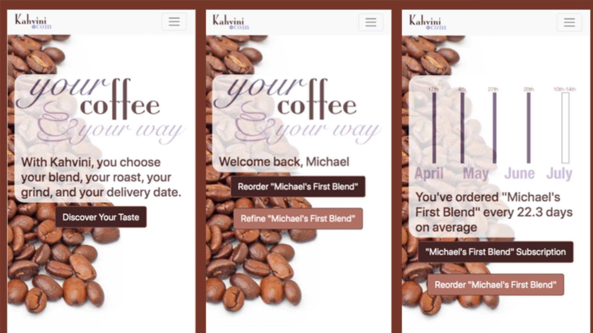
Kahvini is a startup that offers custom coffee blends from different coffe beans from around the world. Each user can choose the coffee beans, choose the percent of each, choose the roast they want, and then choose the grind. The challenge was to get customers from discovering the service to becoming subscribers and eventually brand evangelists.

The Solution
This brand was a new idea, so there needed to be a bit of eduction. Also, to push the user toward subscription, the landing page would change based on the needs of the user, depending on where they were in the user journey. For example, if they had ordered more than once, the content that normally would be in Account > Past Orders is moved to the landing page in order to show the user they have ordered their blend each "X" number of days.
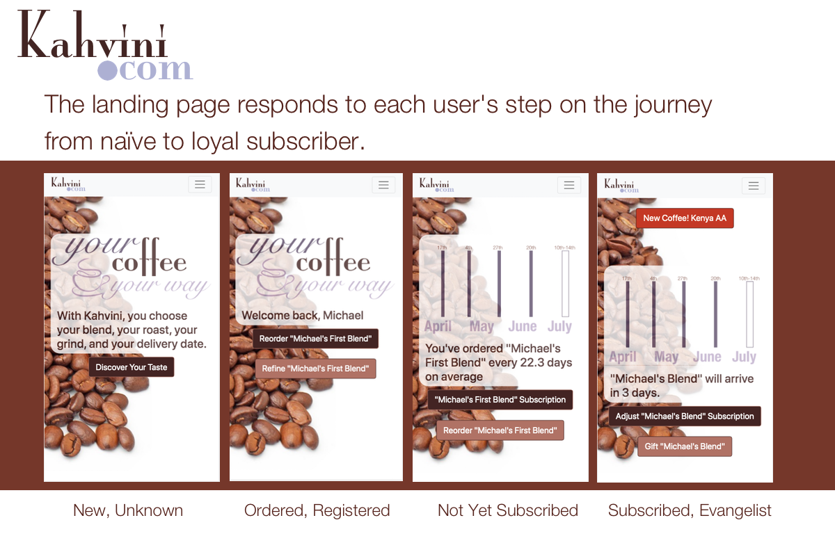
If the user graduates to a subscription and perhaps multiple blends, the home page becomes more of a management/improvement tool, allowing the user to manage his/her subscriptions or disocover new coffees to try.
○ Hyatt
8.3% Increase in Bookings
Accomplishments
Established a design system in both Figma and Adobe XD Sample 1, Sample 2, Sample 3, Created lexicon of approved terminology, increased booking by ~8%, created room booking system across resort families, oversaw design of the UVC app, improved multi-room booking interface.
Sample Initiative: Amstar
A quick explanation - This is a project for Amstar, a company that sells airport transfers and excursions. I worked for Hyatt, which owns Amstar and I was in the division responsible for the Inclusive Collection, Amstar, and the Unlimited Vacation Club.
The Challenge
Amstar wanted a refresh AND they wanted to get more sales (
The Solution
My ‘big idea,’ though, was to make the app more of a travel planner. Amstar sells airport transfers as well as tours, and they wanted to up the number of tours they sold. It occurred to me that once the customer picks an item (excursion or transfer) we know quite a bit about their plans to upsell the opposite item.
If they buy an excursion, we can infer that they are vacationing in the area of that excursion and we can suggest other excursions nearby in the dates surrounding the one booked and remind them that we can make the transfer from airport to hotel easy.
If they buy airport transfers, we really know a lot - we know the beginning and end of their vacation and we know the hotel in which they are staying. We have the opportunity to sell excursions from stem to stern.
Testing
At first, I created an actual travel planner - partially using my own previous work for my ux exercises on my blog. I did a quick paper prototype and tested it with users. In my instructions, I made sure they knew they were going to a company that did airport transfers and excursions, which was the first design’s Achilles Heel - customers were expecting a transfer company, not a travel planning company. That moment of hesitation and confusion meant the full planner was not idea.
Pivoting
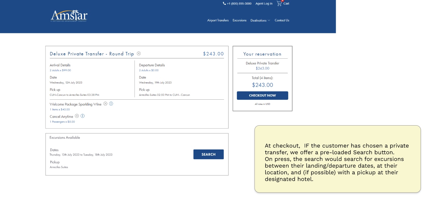
But what about using it more subtly and embedding it into the checkout? The idea was to make it a reminder / easy re-shopping tool. We just use dates to remind the customer that they booked a transfer, now what are they gonna do for a week? Or, alternatively, ‘hey, you booked a boat tour for Tuesday the 25th, why not snorkeling on the 26th?’
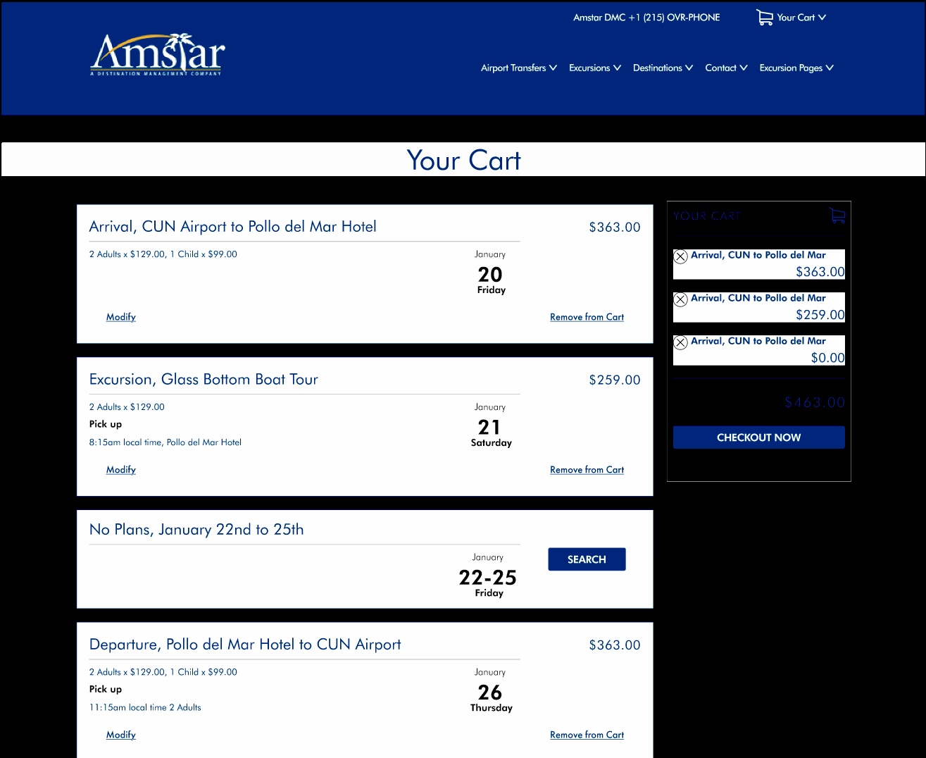
Here are the wireframes for the transfer case. Note the multiple day blank is shortened, to ensure the cart items are always visible. Note the date is prioritized to avoid any confusion. (My apologies for the few illusrations here, but I didn't move the Figma files from Hyatt's account to mine.)
The design tested well with users. For the most part they saw the calendar dates, and most importantly, it didn’t interrupt the flow toward checkout. However, business rules say zero friction between the user and checkout is preferred, so this experience was eventually moved to the receipt page after completing checkout, not prior as shown above. I also recommended the experience be added to confirmation emails and reminder emails, but I do not know if they were implemented.
○ Macy's
$5 Million Saved for the Company
Accomplishments
$5+ million added to bottom line, Digital in Store Shopping app produced, vendor management tool improved, 4 Idea Lab concepts produced from idea to implementation.
Background
I genuinely loved working at Macy's. Every morning I'd get into an elevator alcove that was so old it had a notice that "button calls all cars," (a brass plaque, put in place when elevators were relatively new). I relished the challenge of dragging a legendary company into the digital age.
I was hired primarily for the digital-in-store user experience - shopping kiosks, associate handheld devices, etc. I was also the UX expert for the New York "Magic Lab" where we created new, innovative experiences for internal startups. That was my favorite job - quick sprints where few boundaries existed and the team talked though all aspects of the new business proposal for days. We worked on the principal that for the first segment, no idea was too crazy, nobody could say no, and then in the second segment we edited for money, time, reality. Finally, we sprinted to the end and built what I would call real magic.
Innovation
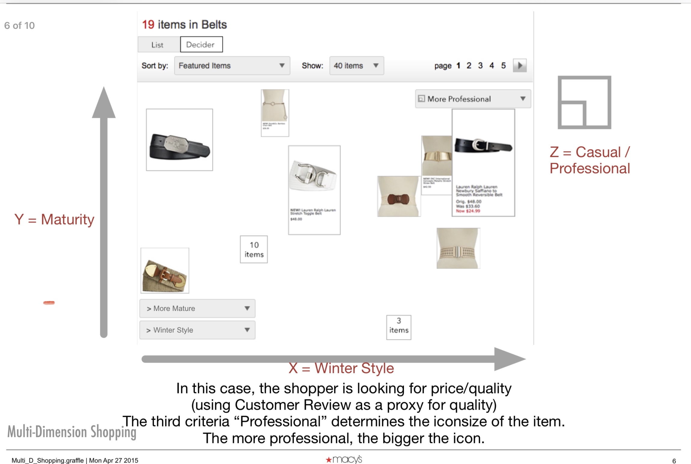
I am the proud originator of the 3-D Shopping interface, called the Decider. It was a concept I created and presented in the Magic Lab (San Francisco), which allows the user to hone in on exactly the product they want, based on dimensions that they choose.
Fun fact: One of the benefits of working at Macy's is that you get to take part in the Thanksgiving Day Parade. I got to be a balloon handler.
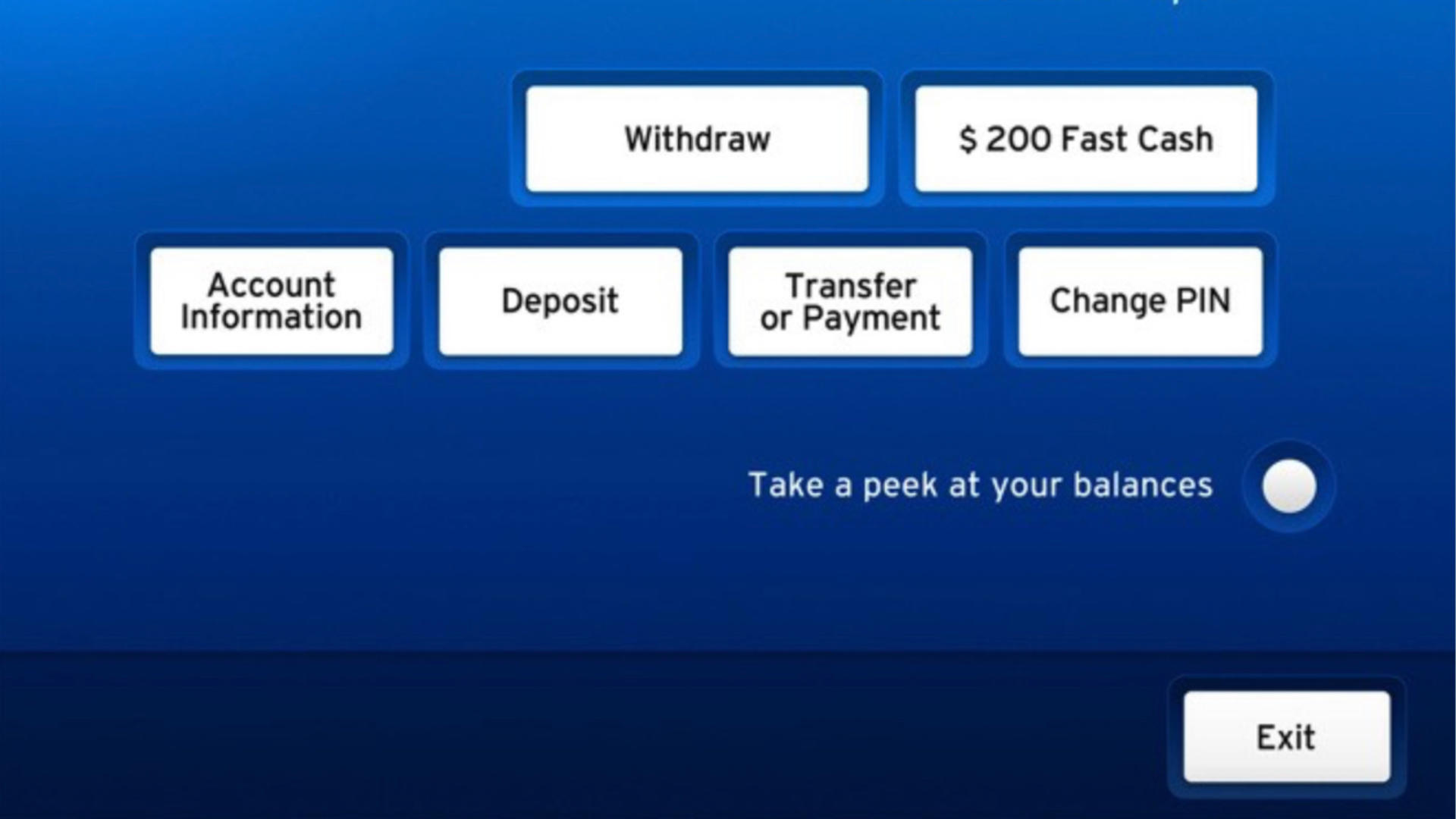
○ International Bank
149,990.4 minutes saved per day
Accomplishments
ATM redesigned, "Done" button invented, visual withdrawal invented, 150,000 minutes of idle time saved per day,
The Challenge
"Major International Bank" wanted to update their ATM interfaces for the first time in years, and as UX Lead, it fell to me to feel out what the client “cutting edge, but not too ‘out there’”
The Solution
I solved this by what I call "defense in depth" - creating a range of solutions from the revolutionary to the prosaic. These ideas included a single interface for all ATM interactions (radical) to adding something as simple as a ‘Next Customer’ button - common sense, when you are standing at an ATM waiting for it to reset.
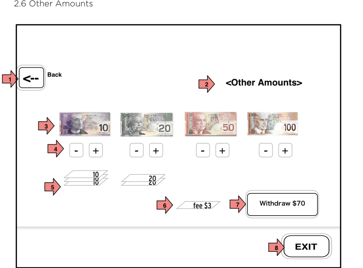
As expected, some ideas were welcomed warmly, others will "wait until the market is ready."
○ Video Bug
Video Interaction Simplified
Background
Video Bug (not real name) was a startup with a very simple idea - make a suite of tools to enhance videos with links, ads, definable buttons, etc. The intent was to partner with YouTube, Vimeo, and others to allow video producers to monetize their videos and use them more as a hub for social interaction rather than an endpoint.
The Challenge
My job was to cram an amazing amount of functionality into a single screen. The screen had to show the video, show the library of previous 'bugs' (buttons, graphics, etc shown on the video), allow the user to add the bugs, animate them, define their actions, define their transitions, even designate the transparency of the bug.
The Solution
I used a pattern that I call "Drag, Drop, and Define." Elements ore manipulable objects that carry information, as are the regions (fields) on which they can be dropped. If any information is not defined in the object or the field on which it is dropped, a further affordance is used to define that information. This sketch shows all of that interaction, although some is limited due to the nature of prototypes. The user is able to create bugs, save them, recall them in a library, drag them to place them on the screen, determine their timeline, etc. If a bug needs to be adjusted, they can be re-edited or duplicated. (User testing showed that inheritence was not understood, so that was left out).
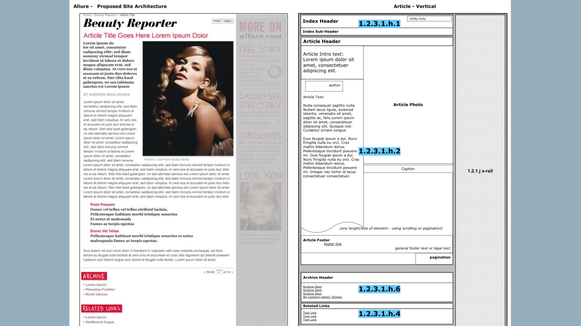
○ Integrated Media Intelligence
Automated Marketing Drag and Drop Reports
The Challenge
Integrated Media Intelligence was a multi-tool for Marketing Directors to quantify and show the impact of their marketing in the news realm. The company (VMS, Inc.) did this by offering keyword searches for a fee. This would result in hundreds of "hits" per day which had to be chosen, organized, and then placed in a standardized report.
The Solution
I designed an interface which, as much as possible, allowed drag and drop, with the system only interrupting if a key piece of information wasn't included in the drag/drop items. I call this pattern Drag, Drop, and Define. In future, I'll probably start rererring to it as Drag, Drop, and Refine since "DDR" is now available as an acronym while "3D" is still taken.
In addition, the entire interface has a work direction - left to right - which is maintained throughout, with minimal resort to modals. This allows the user to 'stack' their work, working on one report at a time, both in the mental and digital senses.
In the original wireframe concepts, there is a "Report Creator" view ('above' the normal flow of work) wherein the user will define their reports as a series of blocks which accept specified media types and specified media outputs (web view, pdf for printing, video file), but one of the ways the company made money was by creating report templates for fee, so that section was removed.
This design was made with a desktop in mind, but I designed it so it could easily be ported to a tablet, with touch and gesture support for nearly all affordances.
○ Delta Airlines
500,000+ of Users Engaged
The Challenge
Delta Airlines wanted to promote their SkyMiles program. They had a budget with millions of miles, and a list of cities that they wanted to promote.
The Solution
Working with the project producer, we came up with the idea of a series of questions for seasoned travelers, questions like ‘Where is the best pizza in Chicago?’ or ‘Which is your favorite museum in Kuala Lumpur?’ If you answered a question, you got SkyMiles. We then turned these answers into a 24 hour roll which was presented on a world map as ‘travel hints’ which got users interested in playing along.
Once it was up and running, it was so fascinating to watch, I even got sucked in and believed I was seeing live tips from fellow travelers, even though I built the thing.
○ Qualcomm
Giant Multinational Redefined
The Challenge
Qualcomm had a problem. Even though they made amazing things for customers, and was considered the "engineers paradise," their customers had no idea who Qualcomm was. When it came time for the inevitable legal battles that ensued, Qualcomm was facing juries who also had no idea who they were.
The Solution
A decision was made to give Qualcomm a more human face. As the lead on this project, I took Qualcomm's research, supplemented my own and created personas to design against. With the help of my small team, we created a dual navigation scheme that offered a traditional, hierarchical structure for returning users (engineers, prior investors, a few other small groups) and a more visual, faceted navigation for those who entered Qualcomm.com with no preconceived notion as to what might interest them.
○ Skiff
User Tools for E-Reader Invented
Background
Such a shame. Skiff was an eReader that was going to challenge the Kindle and the iPad. It got a great reception at the CES conference, and it had great technology behind it.
The Challenge
The idea was to gather newspapers and magazines from the web (or partner databases) scrape the data of any formatting, then reformat the articles in the same style as the newspaper or magazine but now chunked for eReading.
The Solution
The app needed a complete toolset that let the user do more than just read articles - notation, bookmarking, etc. I also got to create the settings section for the app, which presaged the iPhone Settings app.
Sadly, the startup burned through too much cash and wasn't able to build the hardware in enough numbers to make it feasible, so the software (my part) was sold to Newscorp and became the foundations for their app called “The Daily”
○ Humira Mobile
Doctors and Patients Connected
The Challenge
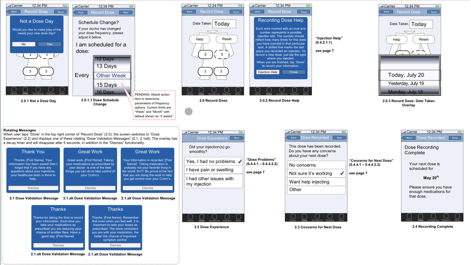
Humira is a drug. It is expensive, you have to inject it, and patients often don't know if it is helping them for 10 weeks or more. It is a hard sell. To combat these negatives, Abbott Labs wanted a tool that would let users know when to take the drug, where to inject it (to minimize pain), and most importantly, show them that their symptoms are getting better despite what they might remember from weeks before.
The Solution
The solution was an app that assisted the user in managing their care. It includes injection scheduling, symptom reporting, reminders for doctor visits, and graphs and charts to show their progress. Most importantly, it gives them a sense of control against a disease that really screws up their lives.
Unusually, this project included a requirement for a flow diagram for developers so there was no question what each screen artifact did.
○ Visual Design
I have not been a professional visual designer for a number of years. At one time, I was a Creative Director, and a damn good one at that. I created the online visual designs for billion dollar companies. In retrospect, I probably could have remained in graphic design and made a good living playing with color and typography, but I decided UX was where my interests and talents converged.
I can still wield Photoshop with the best of them, and keep an old copy of Adobe CS to play with. I am presenting some of my visual work purely because some jobs conflate UX design with graphic design, and I do not want to lose out on those because the vast majority of my portfolio shows UX strategic work. Plus, this is a bit of fun in an otherwise largely somber portfolio.
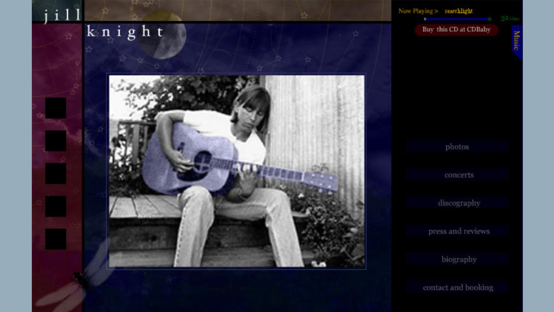
jill knight
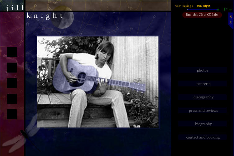
One of my favorite visual designs was for the singer jill knight. My intent was to convey a concert under the stars in California. The website plays jill's music as a soundtrack, and includes a basic MP3 player in a tab (not shown). If you don't interact with the site, it plays a whole CD and does a slideshow of jill's work.
Even more fun, the moon (upper left) will acutally go through phases, the stars, though graphically sylized, will occasionally wink in and out as they are "occluded" by the clouds, and if you spend a long time on the site (an hour), the dragonfly will flutter its wings. I love little Easter Eggs like that.
Beer
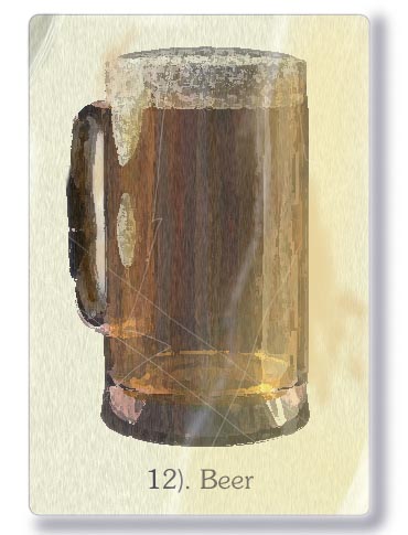
The above image was done entirely in Photoshop.
Everybody and his sister can do "modern" design with photoshop, but how many can reproduce non-digital asset styles? I can. The above was for an alcohol board in Alberta. The idea was 'alcohol spotting' as opposed to bird spotting. That meant a series of cards for each kind of alcohol (wine, beer, scotch, tequila, etc.) to promote going to buy alcohol.
The style is meant to evoke the illustration style from the 1940s and 1950s, which were done in a process called photogravure. All of it, beer, foam, glass, even the slight refraction of the handle attaching to the cylinder is due to my study at an atelier and transfering those skills to the digital realm.
Frontier
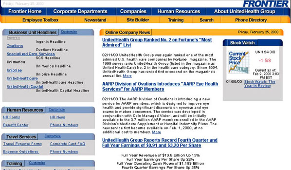
Coporate Design? Check. I designed websites for GIGANTIC corporations. The above is the Frontier, the intranet that I created for UnitedHealth. The Blue and Yellow were specified by the corporate deisign guidelines, the rest was my work.
Bad Boy
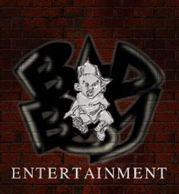
Cool Design? Check. Yes, I created a version of the Bad Boy Records website back in the day. This still is from an animated GIF I created for them. The animated version included police blue and red lights on this 'scene,' the logo is stylized to look like a police badge, a 'Bad Boy' badge.
This is the one and only time I was vaguely associated with "cool."
Frozen North

Occasionally, I'll do work for friends, in this case the Frozen North writers' collective.
The idea was to convey the loneliness of the writers in Minnesota and the upper tier. A cool dark blue wash with a single light on in an attic office does nicely.
Even more subtley, the blue and yellow are the colors of the Swedish flag, again connoting 'north' and to put the reader in the mindset of quality stories.